1. Introduction
Mosaic tiles have long been a significant element in decorative art. As design trends evolve, so do the color combinations and patterns in mosaic tiles. Whether in residential, commercial, or public spaces, the choice of mosaic tile colors plays a crucial role in shaping the overall aesthetic and atmosphere. This article explores the principles of color matching and the latest trends in mosaic tiles, helping you make the best choices for your design projects.
2. Basic Principles of Mosaic Tile Color Matching
2.1 Color Wheel and Complementary Colors
The color wheel is a fundamental tool for understanding color combinations. Complementary colors, which are opposite each other on the color wheel, such as blue and orange, can create a strong visual contrast. If you want to highlight a specific area, using complementary colors in mosaic tiles can create a striking visual impact, making the space more vibrant.
2.2 Analogous Colors and Gradients
Analogous colors are those that are adjacent on the color wheel, such as blue, teal, and green. This color combination creates a harmonious and calming visual effect, ideal for spaces that require a soft ambiance. Additionally, gradient-colored mosaic designs have become popular in recent years, adding depth and dimension to spaces through natural color transitions.
2.3 Neutral Colors and Accent Colors
When using mosaics, neutral colors (like white, gray, and black) are often used as a backdrop to highlight accent colors (like gold, red). This approach maintains the simplicity of the overall space while adding visual focus and design flair through the use of bright colors.
3. Current Trends in Mosaic Tile Colors
3.1 The Return of Earth Tones
With the rise of natural and sustainable design philosophies, earth tones have become increasingly popular in mosaic tile colors. Browns, tans, olive greens, and other earth tones not only bring warmth to a space but also blend seamlessly with various materials and styles, making them a common choice in both modern and traditional designs.
3.2 The Popularity of Blue-Green Shades
Blue-green shades have become a dominant color in many interior designs due to their fresh, calming qualities. Whether in bathrooms, kitchens, or pools, blue-green mosaics bring a sense of coolness and are closely connected with elements like water and nature. Additionally, these shades pair well with metals and wood, creating a retro yet modern effect.
3.3 The Addition of Metallic Colors
Metallic hues in mosaics, such as gold, silver, and bronze, have gained popularity in high-end designs. These colors not only add a touch of luxury to a space but also reflect light, making areas appear brighter and more spacious. Metallic mosaics are often used in accent walls or specific sections to enhance the overall texture of the design.
3.4 The Timelessness of Black and White
Black and white combinations remain a classic choice, regardless of changing trends. Black and white mosaics create a strong visual contrast, suitable for modern, minimalist, or even industrial-style designs. Their simplicity and versatility make them an ideal choice for any space.
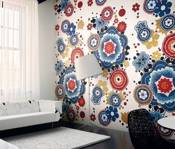
3.5 The Innovation of Mixed-Style Designs
With the diversification of design styles, the use of mixed-style mosaics has become increasingly popular. Designers are boldly combining different colors, materials, and shapes of mosaics to create unique visual effects. This mixed-style approach not only reflects the trend toward personalized design but also breaks conventions, bringing new vitality to spaces.
4. How to Choose the Right Mosaic Colors
4.1 Consider the Function of the Space
The function of the space determines the choice of mosaic colors. For example, bathrooms and pools are suited to cool tones like blue and green, creating a calm and relaxing atmosphere. In contrast, kitchens or dining areas may benefit from warm tones like red or orange to enhance a sense of warmth.
4.2 Incorporate Natural Lighting
Natural lighting significantly affects the presentation of colors. For spaces with ample natural light, choosing darker colors can help avoid excessive light reflection, while lighter or more reflective mosaic tiles are better suited for dimly lit areas to enhance brightness and spatial perception.
4.3 Consider Personal Style and Overall Design
Personal style and overall design theme are key factors in color selection. Whether you aim for modern minimalism or classic luxury, ensure that the mosaic colors harmonize with other decorative elements to create a cohesive and unified space.
5. Conclusion
The choice of mosaic tile colors and combinations plays a crucial role in space design. By understanding the basic principles of color matching and keeping up with current trends, you can infuse your space with unique personality and beauty. When selecting mosaic colors, consider both functionality and aesthetic impact to achieve a perfect balance between design and practicality.